Context

The Disability Resources for Students (DRS) at the University of Washington (UW) and I collaborated together to create a newly updated and accessible website for all students, focusing on students with disabilities, which include vision, dexterity, and other limitations, who use assistive technology and are in need of accessible resources.
I designed and coded a new website for UW Disability Resources for Students (DRS) to provide UW students with disabilities easy access to online resources and support their academic success.
This section will focus on the Academic Skills page, but the FULL DRS website is still in the process of being built and is NOT currently live.
My Team
1 Project Manager
1 Content Writer
1 UX Designer
1 Digital Media and Graphic Designer
Psychologist and Disability Specialist
Note Analysis
My Role and Responsibilities
Graphic Design
Icon Design
UX/UI Design
Digital Media/ Web Design
Challenge
All graphics, infographics, icons, web pages, etc., MUST BE accessible to ALL USERS and ensures compliance with legal standards such the ADA guidelines (Americans with Disabilities Act) and WCAG (Web Content Accessibility Guidelines).
The previous website created accessibility challenges for students with disabilities and was being too text-heavy. My goal was to simplify and reorganize the content to make it more digestible and user-friendly, ensuring all students had easy access to the resources they needed.
Students with different disabilities have very different needs, which makes it hard to identify unified user needs.
Design Question
How might we provide an inclusive, accessible, and useful web experience for all students with disabilities at the University of Washington?
Improve Information Architecture
The website contains a vast amount of information, but the initial version of the Information Architecture (IA) did not effectively guide users through the content. Page titles were neither descriptive nor distinct, making navigation challenging. To address this, I revised the IA to better organize the content, ensuring clearer pathways and more informative, unique page titles.
Visual Elements
I created various infographics to make the web experience more delightful, in addition to helping users better understand complex concepts and techniques. Below are some examples I have created with Adobe Creative Suites, Figma, and Procreate. I ensure to include diversity, inclusion, and accessibility within all graphics I create.
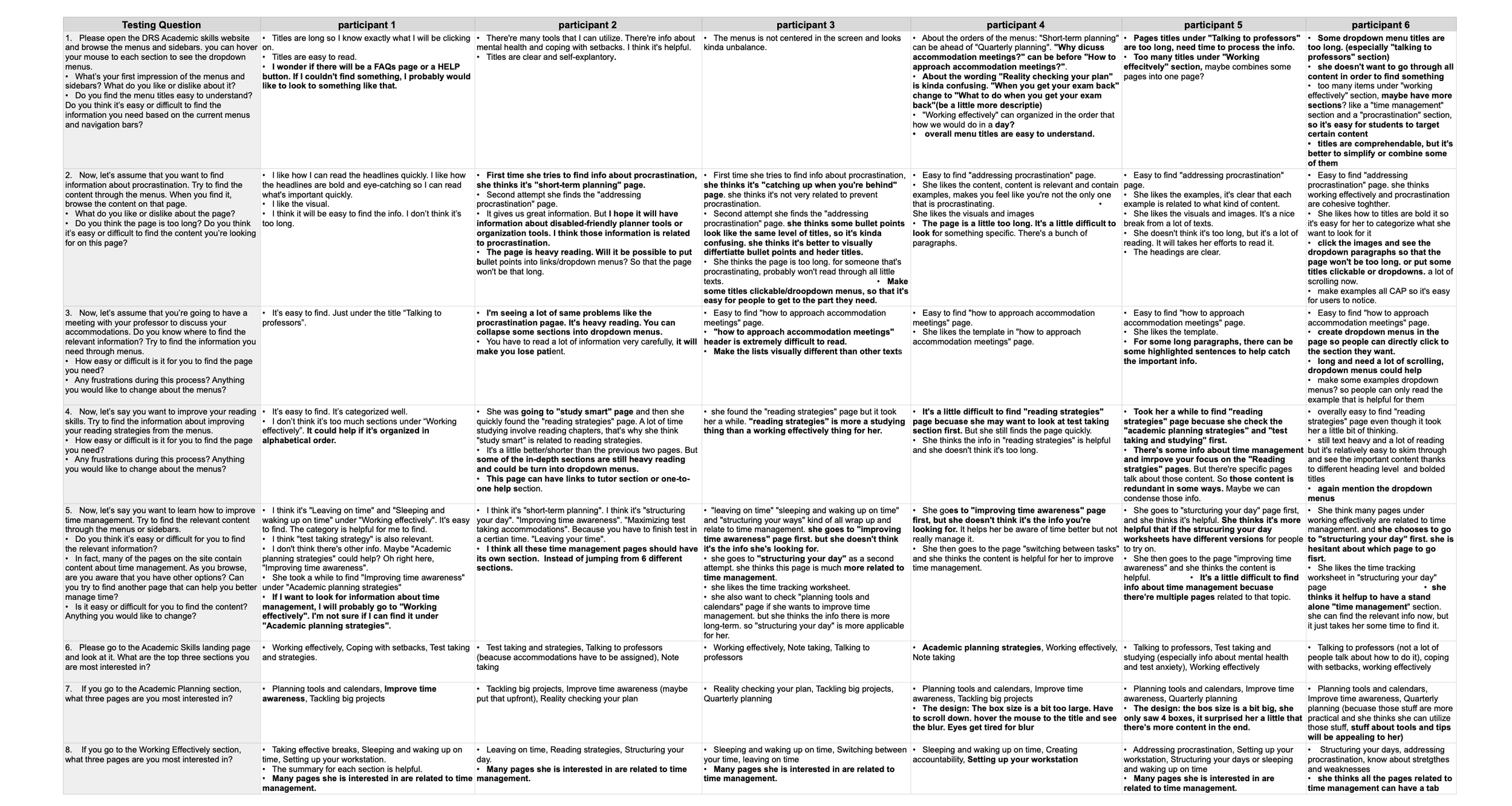
User Testing
After creating the prototype in WordPress, I wrote a usability script to run a test with 6 students with different disabilities (participants did NOT need to disclose their diagnosis and accommodations during the test). Through the test, we mainly hoped to understand:
If students could find the information they need easily.
If the website was still too content-heavy.
Key Insights
Enhance Information Architecture for Better Usability
Streamline Content Organization and Labeling: Improve the structure and labeling of content to make it more intuitive and user-friendly.
Simplify Titles: Make titles more concise, clear, and action-oriented to enhance readability and navigation.
Optimize Banner for Accessibility: Update the banner design to ensure it meets accessibility standards (e.g., contrast, alt text, and responsive behavior).
Implement Accordion Menus: Use accordion menus to organize content into collapsible sections, improving readability and reducing clutter.
Refine Language: Reword content for clarity, consistency, and a more engaging user experience.
Solution
Smooth Navigation: Clear information architecture, intuitive menu, and page titles to help users navigate the site smoothly and find the content they need.
Clear Content Layout: Accordions are fully utilized to break down text-heavy pages and help users browse content accurately.
Ensure Accessibility: Use graphics to make reading more enjoyable and ensure all users can access the text content.
New and Improved Information Architechure

The FULL site is still updating and in the process of going live, but the Academic Skills site is available for preview!
Click the image below to go to the website!
Reflection
Working with students with disabilities was an incredibly meaningful and invaluable experience. It deepened my understanding of web accessibility standards and highlighted the importance of designing inclusive digital experiences.
However, the process of recruiting students with disabilities for user testing proved to be complex and time-consuming. Due to Disability Resources for Students (DRS) procedures, I could not reach out to students directly and had to rely on DRS staff to recruit participants. This delayed the start of user testing, pushing it to a later stage in the project.
As a result, when I implemented navigation and information architecture changes based on user feedback, I had to adjust numerous links and WordPress codes, which was a time-intensive process. Conducting even simple user testing earlier in the project could have saved significant time and effort in the long run.
Currently, parts of the old site remain live as I finalize the updates and revamp. The site's updated version will be launched soon, incorporating the valuable insights gained from this process to create a more accessible and user-friendly experience.